Fintech UX Design: Principles, Examples, and Best Practices for Financial Products
Designing for fintech carries constraints product design in other niches never meets: a regulator shapes the flow, failed transactions cost money, and users have little tolerance for doubt. Financial UX design starts right there.
- UI/UX Design
- FinTech & Finance
October 02, 2026
 AI Overview
Fintech UX design turns regulated financial operations into interfaces people use without hesitation. Its core components are authentication, transaction-state clarity, progressive disclosure of fees, and WCAG 2.2 AA accessibility. Skip them and onboarding collapses: 68% of European consumers have abandoned a financial services application, up from 40% in 2016.


A single misstep — slow onboarding, an ambiguous transaction state, a decline with no explanation — costs users and revenue. Good UX design for fintech is the layer where compliance, clarity, and conversion either cooperate or collide. This guide covers the core principles, named fintech UX examples with measured outcomes, a six-step design process, and what to check before hiring a designer for a regulated product.
UX Design for Fintech: Why It Matters in Financial Products
Strong UX design for fintech is the engine behind products that keep users past the first transaction. Four returns matter most.
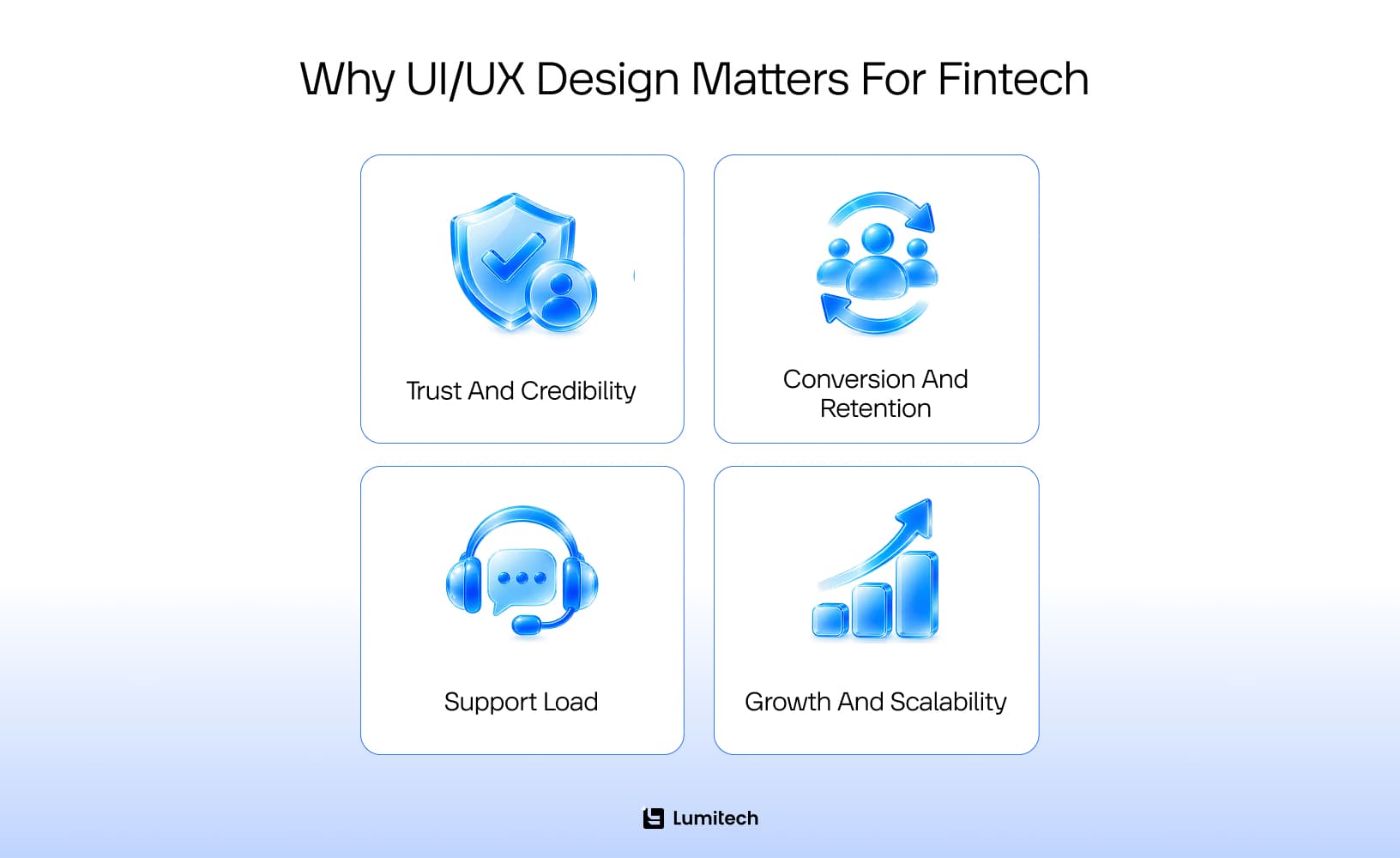
Builds instant trust and credibility. Users hand over identity documents and bank credentials. Clean interfaces, visible security cues, and transparent interactions signal that the product handles both with care, from the first screen onward.
Drives higher conversion and retention. Frictionless UX design for fintech cuts drop-off during onboarding and payment flows. Every step removed from a KYC journey is a percentage of applicants who finish it.
Reduces support load. Self-explanatory flows, honest error states, and in-context help keep tickets out of the queue. Support cost per active customer is one of the few UX outcomes finance teams already track.
Accelerates product growth. A UX strategy for fintech apps built on a shared design system lets the product evolve without a redesign every quarter, and new markets inherit patterns that already passed compliance review.
Core Fintech UX Principles Every Financial Product Needs
Five fintech UX principles carry most of the weight in a financial product. The table maps each one to what it looks like on screen and what breaks when it is missing.
Principle | What it looks like in the UI | What breaks without it |
|---|---|---|
Security and trust | Biometric login, device and session list, visible payout status | Users hesitate at the credential screen and never fund the account |
Simplicity and clarity | Progressive disclosure, KYC split across short screens, saved drafts | Abandoned applications and tickets on basic tasks |
Transparency | Fees, FX rate and arrival time shown before confirmation | Chargebacks, complaints and exposure on disclosure rules |
Personalization | Balance and recent activity first, contextual nudges | A home screen that gives no reason to open the app daily |
Consistency and accessibility | One design system across web and mobile, WCAG 2.2 AA on transactional screens | Cross-device drop-off and, in the EU, a compliance gap under the Accessibility Act |
Security and Trust: The First Principle of Fintech UX
Security and trust is the first principle: in a financial product, security lives in the interface as much as in the backend. Biometric login, a device-and-session list, clear data-use language, and a checkable payout status all read as evidence the product is run competently. Strong authentication that stays invisible in the UI earns none of that credit.
Simplicity and Reduced Friction in Fintech App Design
Simplicity is the second principle, and in fintech app design it means deciding what a screen can ask. Minimal screens, key information upfront, advanced controls behind progressive disclosure, compliance journeys such as KYC split into short tasks with saved progress. Jargon-free UX writing for fintech does the rest: tooltips on regulated terms and labels help first-time users read correctly.
Transparency and Ethical Design
Transparency is the third principle: fees, risks, and terms belong on the screen where users decide. Positive friction supports it — a double confirmation before an irreversible transfer reads as care, and users treat the extra tap as protection.
Compliance is what separates fintech from ordinary product design, and each requirement dictates an interface decision. Strong customer authentication under PSD2 defines how a payment is confirmed and what the confirmation screen must show; the PSD3 and PSR package, politically agreed in November 2025 with final texts published in April 2026, carries those conduct rules into a directly applicable regulation. AML and KYC set how many verification steps are defensible and how to sequence them. PCI DSS constrains how card data is displayed. GDPR governs consent screens and data-use copy. Designed as flows, these stop feeling like walls.
Personalization and Engagement
Personalization decides whether the product earns a daily open. Balance and recent activity belong on the first screen, offers adapt to behavior, milestones get acknowledged. Data visualization turns a transaction log into something a user acts on — where engagement in financial app design actually comes from.
Consistency Across Web and Mobile
One design system covering fintech web design and mobile keeps navigation, terminology, and transaction states identical wherever the user picks the product up — the same discipline that shapes UI/UX branding in the legal industry. Unified components, one glossary, QA automation that catches divergence before release.
Accessibility in Fintech UX
Accessibility in fintech UX is a regulatory requirement in the EU. The European Accessibility Act (Directive (EU) 2019/882) has applied to consumer banking and payment services since 28 June 2025, with EN 301 549 as the harmonized technical standard. The version currently cited in the Official Journal, v3.2.1, is built on WCAG 2.1 AA; ETSI published EN 301 549 v4.1.1 on 2 September 2026, aligning it with WCAG 2.2 AA, and citation in the Official Journal is scheduled for around 30 November 2026.
Design to WCAG 2.2 AA now. The criteria that produce real defects on financial screens are target size, accessible authentication (one-time codes that block pasting fail it), focus visibility, and contrast on charts and status indicators, where color alone often conveys pending, settled, and failed. Screen reader support on transactional screens matters most: an amount or recipient announced incorrectly is a financial error.
Fintech UX Examples: What Good Looks Like
Principles argue; shipped products prove. The four examples below pair a specific interface decision with a result the company or the regulator published — the part of UX fintech work that survives a stakeholder review.
Wise — the Price Before the Decision, and a Reason for Every Rejection
Wise shows the fee, the exchange rate and the estimated arrival time on the send screen, before the transfer is confirmed. The same logic runs through verification: a rejected document comes back with the reason stated and an in-place fix. Wise reported that this change alone cut verification-related support contacts by 22%. In its Q2 2026 update, 77% of transfers arrived in under 20 seconds and 97% within 24 hours.
Monzo — Friction Designed to Protect the User
Monzo launched a gambling block in 2018: a toggle that blocks payments to gambling merchants, with a cooldown of up to twelve months that must expire before it can be lifted. Deliberate friction, built to defeat an impulse. Monzo reports more than 700,000 customers have used it and around 90% of UK banks now offer the same pattern — a design decision that became an industry default.
Nubank — a Branchless Model That Depends on the Interface Holding
Nubank runs banking across Latin America with no branches, putting the whole relationship inside the app: onboarding, card controls, credit decisions, support. The model works only if the interface absorbs the work a branch would do. In Q2 2026, the company reported 139 million customers and a monthly activity rate of 83.5% — engagement at a scale with no fallback channel behind it.
Verification of Payee — a Warning Screen Written into Law
Since 9 October 2025, every euro-area payment provider must tell the payer whether the name entered matches the IBAN, before the transfer can be authorized. The scheme returns four outcomes — match, close match, no match, other — and the answer must reach the user ahead of the confirm action. The payer may still send. Roughly 3,000 banks and providers shipped the same screen within one deadline.
Example | What they changed | Measured outcome |
|---|---|---|
Wise | Rejection reasons shown in-app, editable in place | Verification-related support contacts down 22% |
Monzo | Gambling block with a cooldown of up to 12 months | 700,000+ customers have used it; ~90% of UK banks copied it |
Nubank | Branchless model, full relationship in-app | 139M customers, 83.5% monthly activity rate (Q2 2026) |
Verification of Payee | Name-vs-IBAN check shown before authorization | Mandatory for euro-area providers since 9 October 2025 |
Banking UX Design vs. Fintech UX: Where the Constraints Differ
Banking UX design and fintech UX share a regulator and diverge on almost everything else. Three constraints explain the gap.
Legacy core banking. A fintech startup owns its data model. A bank designs on top of a core system that may predate the web, where a balance updates on a batch cycle and a transaction reference is a fixed-width string. Real-time states, search across full history, and inline edits all have to be negotiated with what the core can return. Good banking app ux is frequently the craft of concealing a settlement delay without lying about it.
A wider regulatory perimeter. Deposit protection disclosures, complaint routing, vulnerable-customer duties and audit trails all surface in the interface. Screens a fintech iterates weekly require sign-off in a bank.
A different user. Fintech products are adopted first by people already comfortable with app-only money. A retail bank serves everyone, including customers who have never used biometric login and whose alternative is a branch. Mobile banking ux therefore optimizes for the second-time user on a mid-range Android device. Defaults matter more than features, and the first screen carries the product: balance, recent transactions, search, and a payment flow one tap away. This is also where UX design financial services teams meet their hardest constraint — every simplification has to survive an audit.
How to Design a Fintech App: A 6-Step Process
Most teams know the steps. The version below is adjusted for regulated products, where a design error surfaces as a chargeback, not a bounce.
Discovery and UX research. Qualitative interviews with people who hold the product’s actual job — a wealth manager, an operations lead, a first-time borrower. Rigorous research separates what users say about money from what their statements show. UX research for fintech startups runs lean: six to eight interviews and a competitor teardown beat a research program nobody has budget to finish.
Flow mapping. Every state, including the ugly ones: declined card, failed KYC, partial refund, provider timeout. Map failure paths first, because trust is won or lost there.
Prototyping. Clickable flows with real-looking amounts, real fee structures, and real error copy. Placeholder data hides the exact ambiguity you are testing for.
Task-based usability testing. Test tasks: complete KYC, send a transfer to a new recipient, recover from a failed payment, apply for a loan, and read the decision. Success means the task is completed unaided, and the user can explain what just happened to their money.
Design system. Components, states, tokens, and an accessibility baseline written into the system at the start, never reviewed at the end. Here fintech product design stops being a set of screens and becomes infrastructure.
Handoff to engineering. Annotated states, edge cases, and copy in one place. Serious fintech app design and development keeps designers on the build through release, because the states that get dropped are always the rare ones — and in finance, the rare ones are the expensive ones.
Financial UX Design: Best Practices for Conversion Optimization
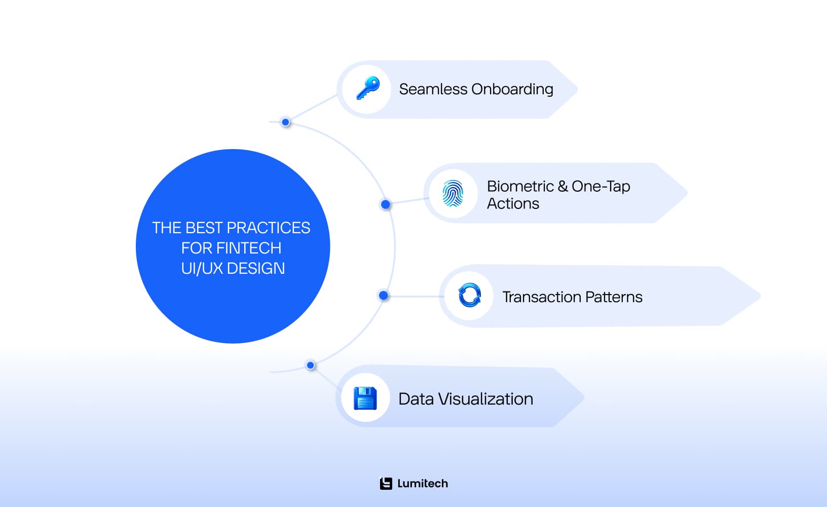
An intuitive experience pays only when it moves users from interest to a completed action. So how to build trust in fintech UX while keeping conversion high? The practices below drive the biggest gains.
Ensuring Seamless Onboarding
Onboarding is where the user journey begins, and where most financial products lose it. UX research for finance keeps landing on the same finding: friction, not pricing, is where sign-ups die. Signicat’s Battle to Onboard research, covering 7,600 consumers across 14 European markets, found 68% had abandoned a financial services application — up from 63% in 2020 and 40% when the study began in 2016. Three reasons tied at 21% each: the process took too long, it demanded too much personal information, or the applicant changed their mind.
Progress indicators, short tasks, an explicit next action, and saved progress turn a bureaucratic form into a path someone finishes. Request each document when it becomes necessary, and explain why.
Biometric Authentication and One-Tap Actions
Biometrics and one-tap confirmation are faster and more secure at once, which is rare. Users authorize payments with a glance, and the security step stops competing with the task. Keep an accessible fallback: WCAG 2.2 AA requires an authentication path that does not depend on a cognitive function test.
UX Patterns for Financial Transactions
Reliable UX patterns for financial transactions separate a payment screen that gets used from one that gets abandoned. Five carry the load.
Confirm before send. A review screen showing recipient, amount, fee, and arrival time, plus the payee-name check where regulation requires it. Irreversible actions earn a confirmation step.
Honest transaction states. Pending, settled, and failed must be visually distinct and never signaled by color alone. Displaying a pending payment as complete creates a support ticket and a fraud report.
An undo window. Where the rails allow cancellation, expose it with a visible countdown. Where they do not, say so before confirmation.
Repeat payment. Paying the same recipient again should take one tap from the transaction record, amount pre-filled and editable.
Provider error handling. When an upstream provider fails, name what happened, state where the money currently sits, and give one next action. Generic error copy here turns a solvable incident into a churn event.
Micro-Interactions and Instant Feedback
Micro-interactions are subtle and load-bearing. An animated checkmark on a completed transfer, a status change, a haptic tap on confirmation — each closes the loop the user opened by pressing send. Silence after a financial action reads as failure.
Data Visualization: User Experience Financial Services Teams Can Act On
Dashboards are where a financial product either earns a daily open or loses it. The user experience financial services teams rely on comes down to one question: does the first screen say what changed, by how much, and what to do about it? Charts, trends, and comparisons replace a table of rows nobody scans. For retail users, this turns spending history into a decision; for business users, it removes a reporting request from someone’s queue.
UX for Lending and Loan Platforms
Lending carries the heaviest disclosure burden in fintech, and four screens decide how it lands. APR and total cost of credit belong beside the monthly figure at the same visual weight — a monthly payment shown large with total cost buried below is a dark pattern whether or not it satisfies the letter of the rule. The repayment schedule should be visible before signature, with the full series of dates and amounts. Early repayment needs its own reachable flow, including what it saves. And the rejection screen is the most under-designed screen in lending: state the decision, explain what can be reconsidered, give a route back. Applicants who are declined remember that screen for years.
Common Fintech UX Design Mistakes and How to Avoid Them
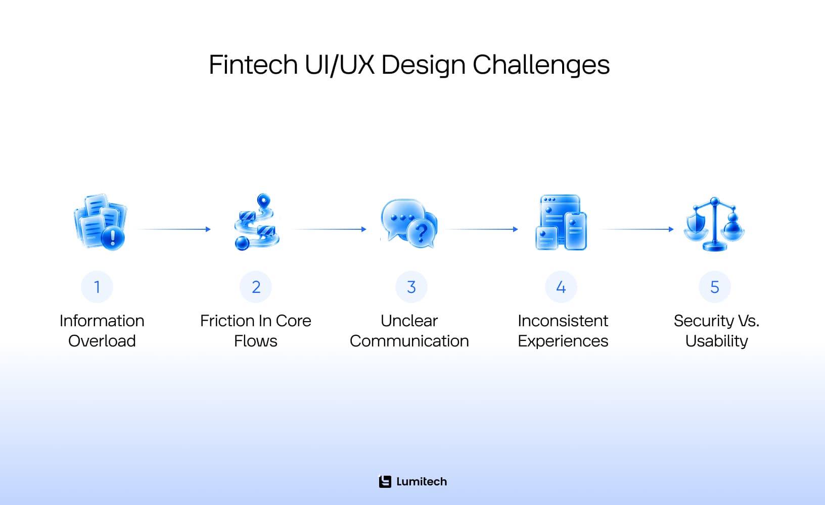
Professional fintech design balances security and usability on every screen. Sounds difficult, and it is. The failures below recur across audits, and each is solvable with fintech software development expertise applied early enough.
Information Overload and Complexity
Users facing a cluttered dashboard or too many decision points freeze, abandon the task, or make costly mistakes. The costs are predictable: support volume, abandoned transactions, drop-off.
The fix is to simplify complex financial flows — and that is UX work, not a copy edit. Reduce each screen to what the decision requires, move the remainder behind progressive disclosure, and use visualization to make dense data legible. Audit every screen against one question: what is the user deciding here?
Friction in Onboarding and Core Flows
Lengthy processes such as KYC or multi-step registration drive abandonment, and weak transaction patterns do the same when money moves. Every friction point can mean a lost client and lost future revenue.
Onboarding as a guided journey solves most of it: segmented steps, a progress indicator that means something, smart defaults, and resumption exactly where the user stopped.
Unclear Communication
Financial jargon, late fee disclosures, and instructions that assume domain knowledge erode trust quickly. Signicat’s research found a poor onboarding experience leaves more than half of customers less inclined to use that provider again — the damage outlasts the session. Fenergo’s 2025 industry survey put the institutional side of the same problem at 70% of financial institutions losing clients over inefficient onboarding.
Best-practice UX writing for fintech pairs every feature with plain-language messaging, contextual help, and visual cues that make risk and reward legible at the point of decision.
Inconsistent Experiences
Drop-off spikes when users move between devices and the product behaves differently. Mismatched navigation and terminology send people to competitors. Unified design systems with atomic components, style guides, and QA automation should be part of both web and mobile development services from the start, so transaction states mean the same thing everywhere.
Balancing Security vs. Usability
Overly complex security fatigues users; too little exposes the business to compliance risk. Both failure modes come from treating security as a layer applied at the end. Delivering UI/UX design services for regulated products, Lumitech frames the tension as a chance to demonstrate reliability: biometric authentication, deliberate micro-delays as positive friction, and step-up authentication triggered by risk, never applied to every action.
AI in Fintech UX: Where It Helps and Where It Breaks Trust
AI earns its place where it removes work: categorizing transactions, surfacing anomalies before the user finds them, and explaining what moved a portfolio overnight. Lumitech’s AI-powered investment intelligence platform uses retrieval-augmented generation for exactly that.
It breaks trust at the point of a decision the user cannot interrogate. A declined loan, a frozen account, or a flagged transaction handled by an opaque model produces a support conversation nobody can resolve. Two rules hold: show the inputs behind any AI-assisted decision that affects access to money, and keep a human route visible on every screen where automation makes a call. An assistant that cannot say “I don’t know, here is a person who does” is a liability in banking.
Ready to turn fintech UX challenges into strategic wins?
Let Lumitech’s experts help you simplify flows, strengthen security, and design onboarding that converts.

When to Hire a Fintech Designer (and What to Ask)
The moment to hire fintech designer capability is before the first compliance-bound flow gets built. A designer who has never shipped a regulated product will design a KYC journey that fails review and a transaction screen that misstates a pending state.
What belongs in the portfolio. Regulated products, not landing pages: an onboarding flow with real KYC steps, a payment confirmation with its error states, a dashboard built on live financial data. Ask which constraints shaped each decision and what the compliance team pushed back on. A designer who cannot name a constraint has not worked inside one.
What to ask. How they handle a declined transaction. How they test a flow where failure cases matter more than the happy path. What they do when legal requires a disclosure that damages conversion.
Red flags. Visual polish with no transaction states. No accessibility work on a product serving the EU. Research that consists of competitor screenshots. A handoff that ends at the Figma file.
Designer or agency. An embedded product designer suits continuous work on one product. An agency fits a defined scope — an audit, a redesign, a design system — and brings pattern exposure across several regulated products. Screening fintech software development companies against your own scope is a reasonable first filter; Lumitech’s design team works both ways.
Designing Great User Experience in Fintech: Lumitech’s Customer Stories
Three fintech products, three different constraints.
SignalSigma — Investment Analytics for Finance Professionals
SignalSigma is an investment analytics platform built from scratch with Andrei Sota, a Bucharest-based investor and product owner who specified it after auditing the competitive field himself. The brief: consolidate fragmented research tools into one dashboard for wealth managers.
Design work began with workflow mapping and prototyping against how analysts actually reach a decision. The Portfolio dashboard became the command center — risk explorer, factor exposure, sector breakdown, orders and trades in one view, with rebalancing and trade simulation reachable from the same place. The platform runs in production at signal-sigma.com, and the engagement holds a 5.0 rating on Clutch.
CincyFoods — Instant Cashback and Receipt Scanning
CincyFoods pays cashback on everyday purchases by scanning a receipt, while directing a share of the reward to local schools and family-owned businesses. Reward logic that complex works only if the interface hides none of it and asks for none of it.
The flow reduces to three actions: sign up, complete a mission, receive money that is immediately spendable or withdrawable. AI-powered receipt processing removed manual entry, a built-in map made nearby vendors easy to find, and contributor groups let families pool rewards. Vendors got a customizable admin panel with visual reports. The loyalty program UX lessons from CincyFoods are documented separately.
AI-Powered Investment Intelligence Platform
For a Panama fintech startup, Lumitech built a RAG-based investment intelligence platform that aggregates data across multiple brokers and explains market events against a user’s live portfolio. The design problem was explainability: an AI answer about someone’s money has to show what it read. Every generated insight traces back to a retrievable source — the pattern that makes AI defensible in a regulated product.
Conclusion: Building Trust, Speed, and Clarity in Digital Finance
UX in fintech sits at the center of trust, regulatory compliance, and growth. Products that win keep three things true at once: security the user can see, flows that survive their own failure cases, and disclosure that arrives before the decision.
Start with the five principles, fix the transaction states, and hold WCAG 2.2 AA as the accessibility target while EN 301 549 v4.1.1 works through citation. Investing in fintech UX design is investing in conversion rate, support budget, and audit outcomes at the same time.
Lumitech’s approach to UX design for fintech is measured in outcomes: onboarding drop-off, conversion, engagement. Whether the next step is a full audit, an improvement roadmap, or the decision to hire fintech designer capability for a regulated build, get in touch.